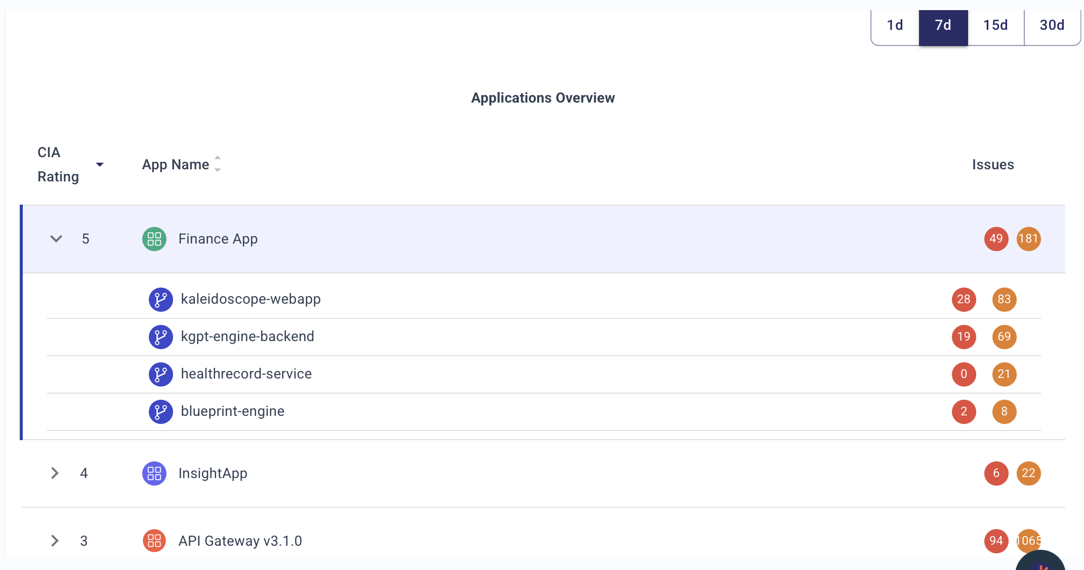
Application Overview
🎯 1. Day in the Life of an AppSec Engineer Using This Chart
An AppSec engineer will:
-
Morning check-in:
- Review all applications, their Business Ratings, and vulnerability counts at a glance.
- Focus first on high-business-impact apps (e.g., Application Name 1 with score 98).
-
Prioritize triage:
- Investigate applications and repositories with the highest number of Critical (red) and High (orange) issues.
-
Pipeline health review:
- Quickly verify which PBOM scans (e.g., SAST, Secrets, PII, Cloud security) are active for each app and repo via the icons.
-
Assign actions:
- If an app or repo has critical issues and incomplete PBOM coverage, escalate for immediate remediation, or flag for security champions.
-
Prepare reports:
- Pull quick numbers for weekly reporting to AppSec leadership or development teams — "Top 5 apps with most criticals."
⚙️ 2. Impact on AppSec Operation
This dashboard view enables:
-
Unified Risk Visibility:
- Shows the risk posture at the application level with repo drill-down — allowing aggregation and prioritization.
-
Faster SLA tracking:
- Instantly detect apps that may violate vulnerability remediation SLA based on open critical/high findings.
-
Pipeline Assurance:
- AppSec engineers can easily validate whether full security testing is integrated across Dev → Build → Deploy pipelines.
-
Business-Context Prioritization:
- Business rating ensures security teams focus on high-value or customer-facing apps first, not just tech debt.
🚀 3. What Decisions This Chart Drives
-
Which apps are most at risk?
- Based on critical vulnerability counts combined with Business Rating.
-
Where is PBOM coverage incomplete?
- Missing icons for phases (e.g., no cloud security scan) triggers follow-up.
-
Which repos under an app need immediate action?
- Repo-level breakdown shows how risk is distributed internally.
-
Where should resources be allocated?
- High-risk, business-critical apps (98 rating) take priority for AppSec escalations or audits.
-
Are pipeline security gates working?
- If PBOM icons show gaps (e.g., no SAST, no IaC scan), need engineering fixes.
🗂️ 5. Detailed Description of the Chart
| Field | Meaning |
|---|---|
| Business Rating | A score (likely 0–100) reflecting app's importance to business. Higher = more critical. |
| App Name | Application under management. Expanding shows associated repositories. |
| Issues (Critical, High, Medium) | Colored dots (🔴 critical, 🟠 high, 🟡 medium) with counts for each severity. |
| PBOM (Pipeline Bill of Materials) Icons | Small icons representing security scans integrated at different phases (e.g., SAST, Secrets detection, PII scan, Cloud security). |
🔵 PBOM Icon Interpretation (based on common ASPM practices):
| Icon | Likely Represents |
|---|---|
| Shield | SAST (Static code analysis) |
| Shield + Lock | Dependency/Package Analysis (SCA) |
| Expansion Arrows | PII/Secrets scanning |
| Document | Build Artifact Security (e.g., SBOM generation) |
| Magnifying Glass | DAST or API Security Scan |
| Eye Mask | Secrets Management (runtime secrets scan) |
| Package Shield | Container Security |
| Cloud Icon | Cloud/IaC Security |
🎨 Color Coding for Issue Severity:
| Color | Meaning |
|---|---|
| 🔴 Red | Critical vulnerabilities |
| 🟠 Orange | High severity vulnerabilities |
| 🟡 Yellow | Medium severity vulnerabilities |
🛠️ Probable Data Sources Feeding This View
(Just briefly, as you asked to exclude deep details)
- Vulnerability scanners (SAST, DAST, SCA)
- Secrets scanners
- Infrastructure as Code (IaC) scanners
- Cloud posture management tools
- Repository metadata (GitHub, GitLab, Bitbucket)
- Business metadata from CMDB, Jira, or internal app catalogs
📌 Summary
The Application Overview chart gives AppSec engineers a single pane of glass to:
- Prioritize applications by business risk and security risk.
- Audit PBOM coverage across dev-build-deploy phases.
- Triage open criticals quickly across applications and repos.
- Drive data-driven, business-aligned security decisions — not just fix findings randomly.